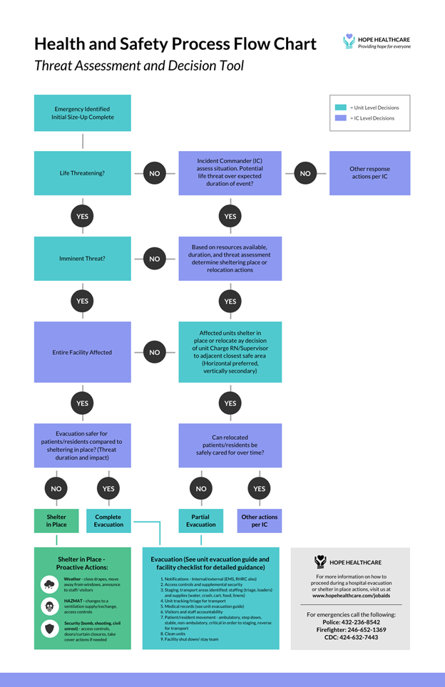
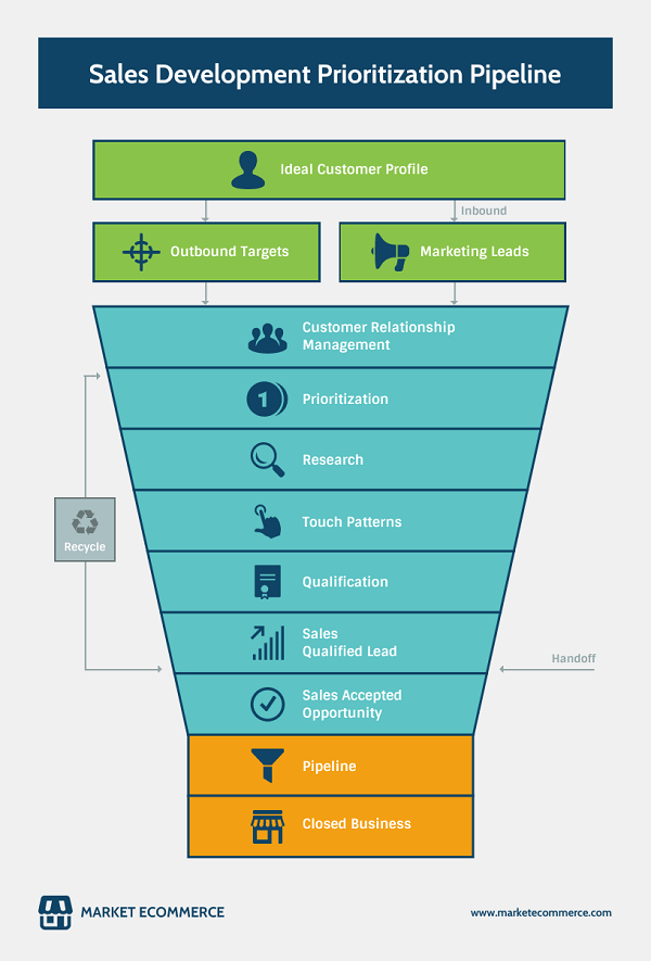
Flowcharts aren’t as simple to make as you think. Since they are a visual representation of a system or process, you need to be careful when designing them. If you don’t plan your design well, you can easily end up with a chart that’s confusing, overwhelming, and inaccurate.
To make an effective flowchart, there are several elements you need to focus on. Below is a quick overview of each one.
Consistency
Table of Contents

When making a flowchart, you have to make sure that your texts, lines, and shapes are consistent. Take a good look at their sizes and the spacing between them. Make sure that all of them are aligned uniformly.
Consistency in your design helps eliminate unnecessary distractions. Plus, it makes your data flow smoothly, making it easier to understand and follow.
You need to ensure that all the elements have equal spacing between them. Most drawing programs will require you to do this manually and they can take a lot of your precious time. So if you are looking for a flowchart maker, look for one that comes with automated drawing.
Check out Venngage. It has high-quality and user-friendly templates even for those without any experience in designing.
Size
In case you are doing a diagram that’s too big to fit into a single page, you can divide it into multiple charts. Just connect them with hyperlinks to avoid confusion.
If you are making a flowchart that’s just slightly too big for a single page, you can scale it down. But keep in mind that when you scale down your chart, it’ll affect the font, too. Double-check to make sure your text is still readable.
Consider this — if you are using a 10-point font and you scale down your flowchart to around 60% of its original size, your font will also be reduced to six points.
You can avoid this by using a larger font before scaling down.
Clarity
Flowcharts are supposed to make your audience easily understand the steps and processes. Remove any ambiguity in your chart. It needs to be easy to follow.
For example, if your chart has more than 20 symbols, it’ll likely confuse and overwhelm your audience.
It’s also a good idea to check your data. They need to be relevant and updated. Otherwise, you’ll just end up causing confusion and misunderstanding.
You also have to check your symbols. They have to be clear and direct to the point.
Color

There’s nothing wrong with being creative when making your flowchart. However, for clarity and ease of understanding, avoid using a dozen unnecessary colors in your chart.
To keep your chart simple, you can pick one main color. Then, choose two to four more colors that will compliment your main option.
Text
When making flowcharts, consider using a larger text size. Bigger fonts tend to draw more attention and put emphasis on whatever you want to highlight in your charts.
However, this is not an absolute rule. You also have to consider the size of your flowchart and keys.
Apart from size, you also have to consider font styles. Your text needs to be easy to read even from afar. It shouldn’t cause eye strain.
Title
As in most types of data visualization, you have to be careful when writing the title of your flowchart. It needs to be catchy to draw the interest of your audience enough to make them stay and look at your chart.
Keys

You have to use symbols that are easy to understand and are self-explanatory. They need to be easy to decipher without the need to look for more explanations.
Most flowchart makers have symbol key templates you can use. You just have to pick ones that relate to your data the most.
Images
Flowcharts aren’t just about boxes and arrows. You can add images to boost its communicative power. You can include icons or your company logos.
You also have the option to add images. However, to create the right impression, make sure to use only high-quality images.
Also, don’t overdo your illustrations. You wouldn’t want to distract your audience or leave them feeling confused about your main points. Only use images that are necessary to show your point. You don’t have to add photos just to make your flowchart look beautiful. You have to focus on the main reason why you’re using flowcharts.
Comments
Even if you feel like you’ve made the perfect flowchart, you should still let a trusted colleague see and take a second look at your work. A fresh set of eyes can help point out mistakes. Your co-worker may even have suggestions that can improve your flowchart.
If you don’t have a co-worker with you when making your chart, consider taking a second look at your design a day after you’ve finished it. Tired eyes can make you overlook mistakes.

